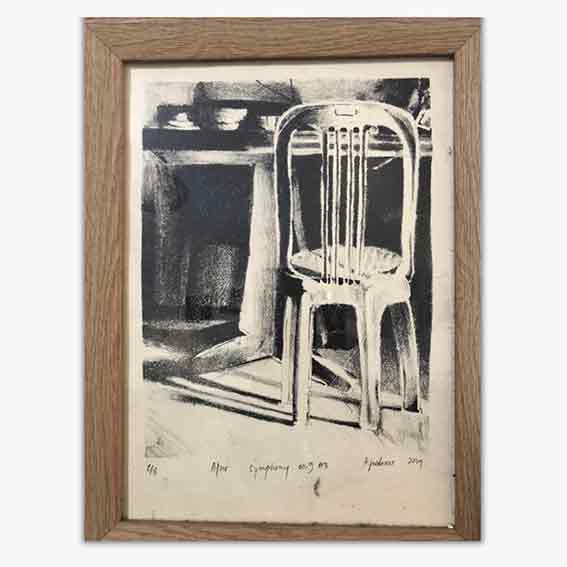
Lately, we’ve been admiring the works of Serio Press a California-based screen print studio. We are really impressed with how far they brought screen print. One of the most impressive prints we’re particularly a fan of is Cut Dick by Ryan Travis Christian, printed in 2019.
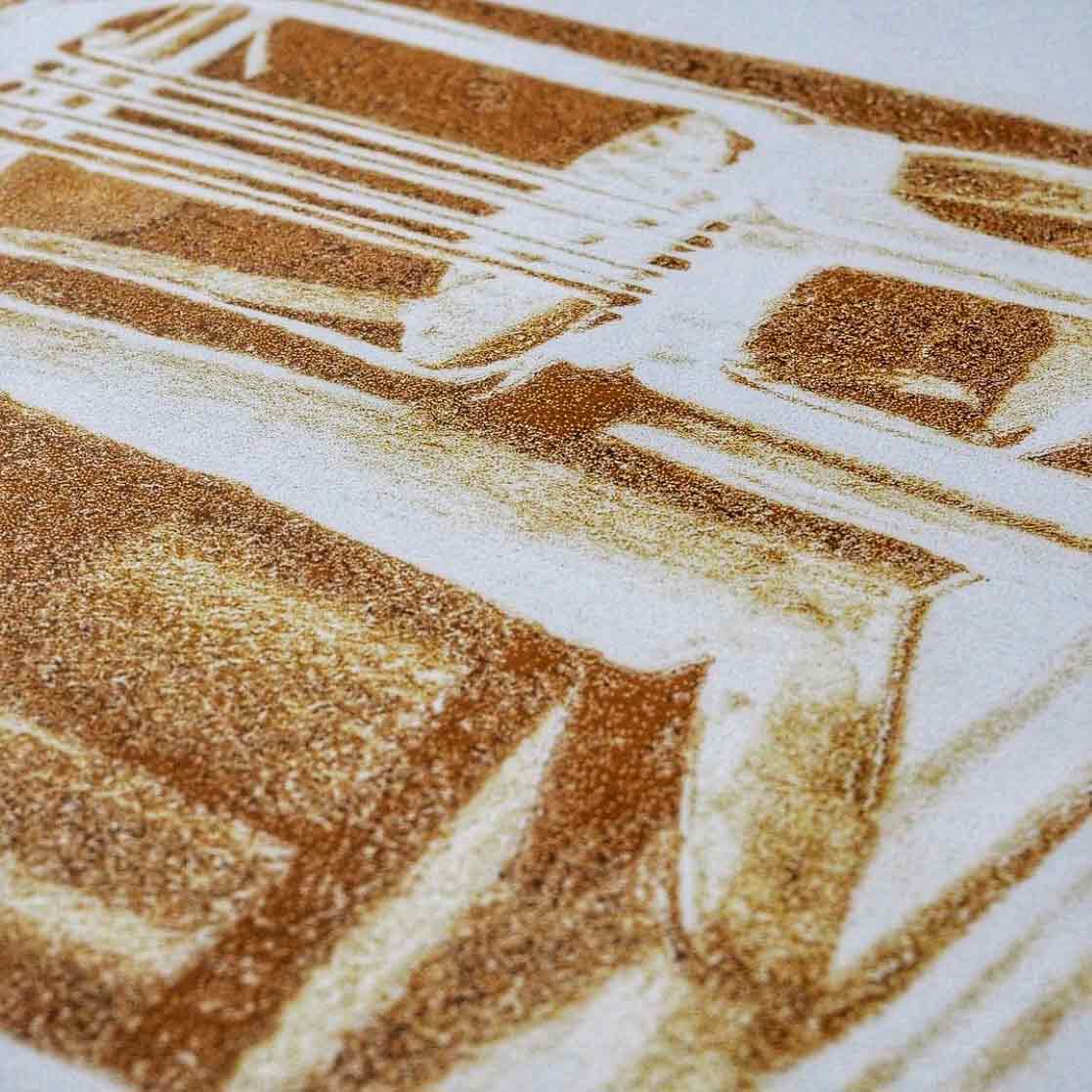
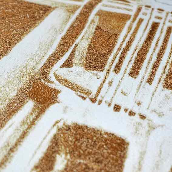
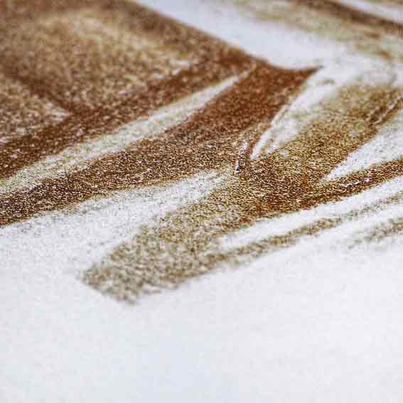
After some investigations, we found that the dither effect was used instead of the usual halftone raster. Dither effect has random patterns, this is different from the conventional regular pattern of halftone. This results in dramatically distinct and textural visuals, suitable even for grainy monochromatic prints.
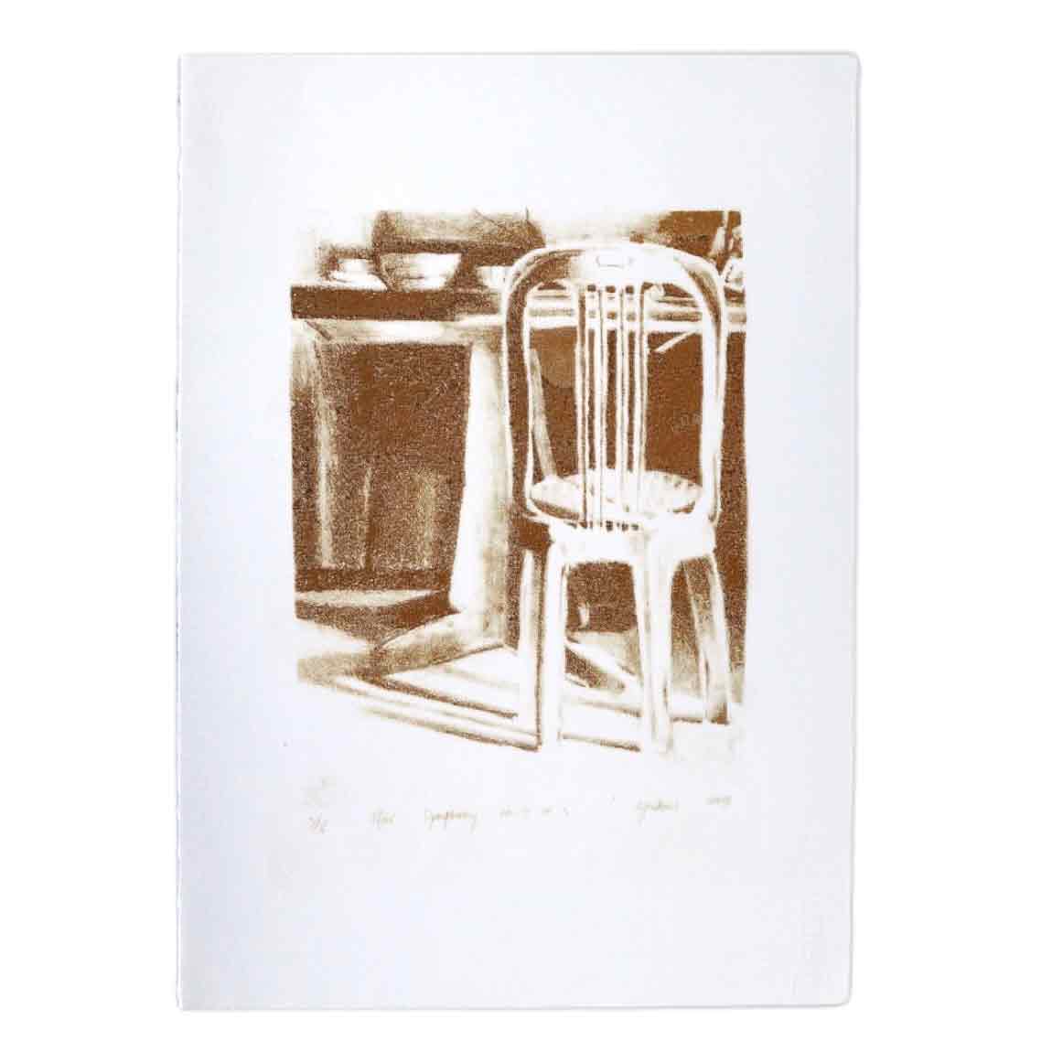
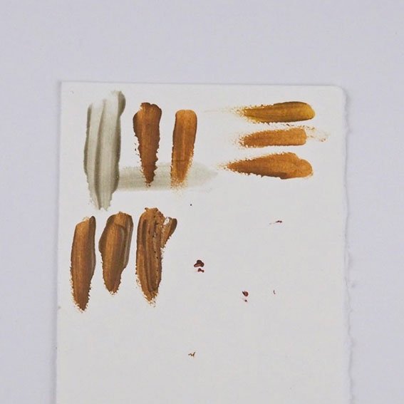
For this particular experiment, Jordan reproduced his lithograph print as a screen print. Trying to investigate how well this dither effect could render the grainy characteristics of a lithograph, he broke down his original image to several layers of different values. This is where things are getting experimental since the colour sequence of printing really affects the end result.
While the results are quite interesting, we believe that we can push this technique further. While playing further with monochromatic prints, we keep rethinking and exploring how we can apply this technique best for multicolor prints.

Written at utmost carefulness by Kevin Jordanus
Edited and translated grudgingly by Rinaldo Hartanto
Printed anxiously by Jordan while listening to Ekspresi Warga Indie vol.1 by Prontaxan on Youtube.